MTS Ecosystem
MTS began its development as a mobile operator but over time grew into a large ecosystem of digital services. The old identity could no longer reflect the intended meanings and could not encompass all the visual styles, so the company decided to rebrand. As part of the rebranding, we had to develop a new 3D style.
3D became one of the central elements of the MTS identity; it had to reflect the company’s values and philosophy—to step outside the box and transform everyday life.
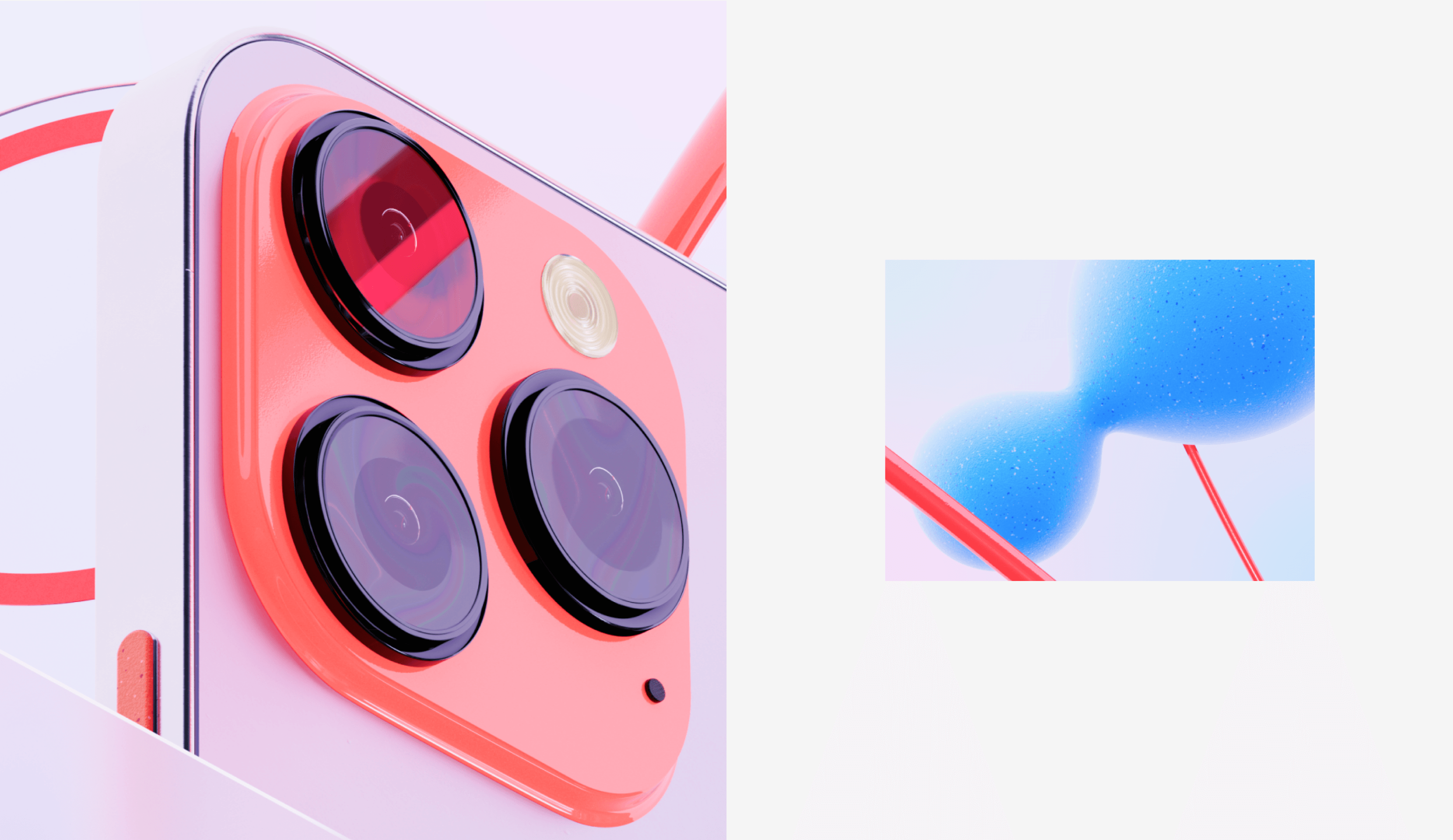
We created a 3D language for the entire ecosystem — both for the parent brand and for numerous sub-brands. The language unified all MTS communications, leaving each sub-brand room for self-expression.
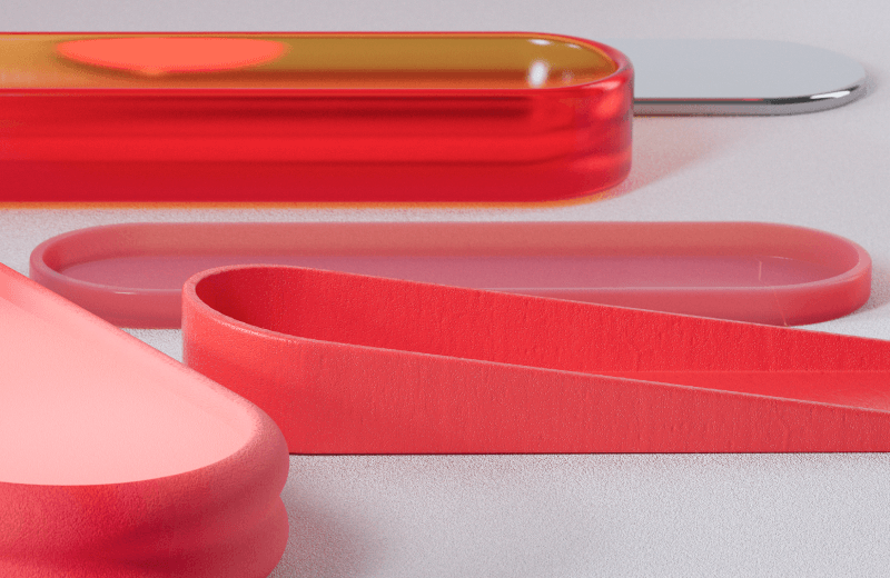
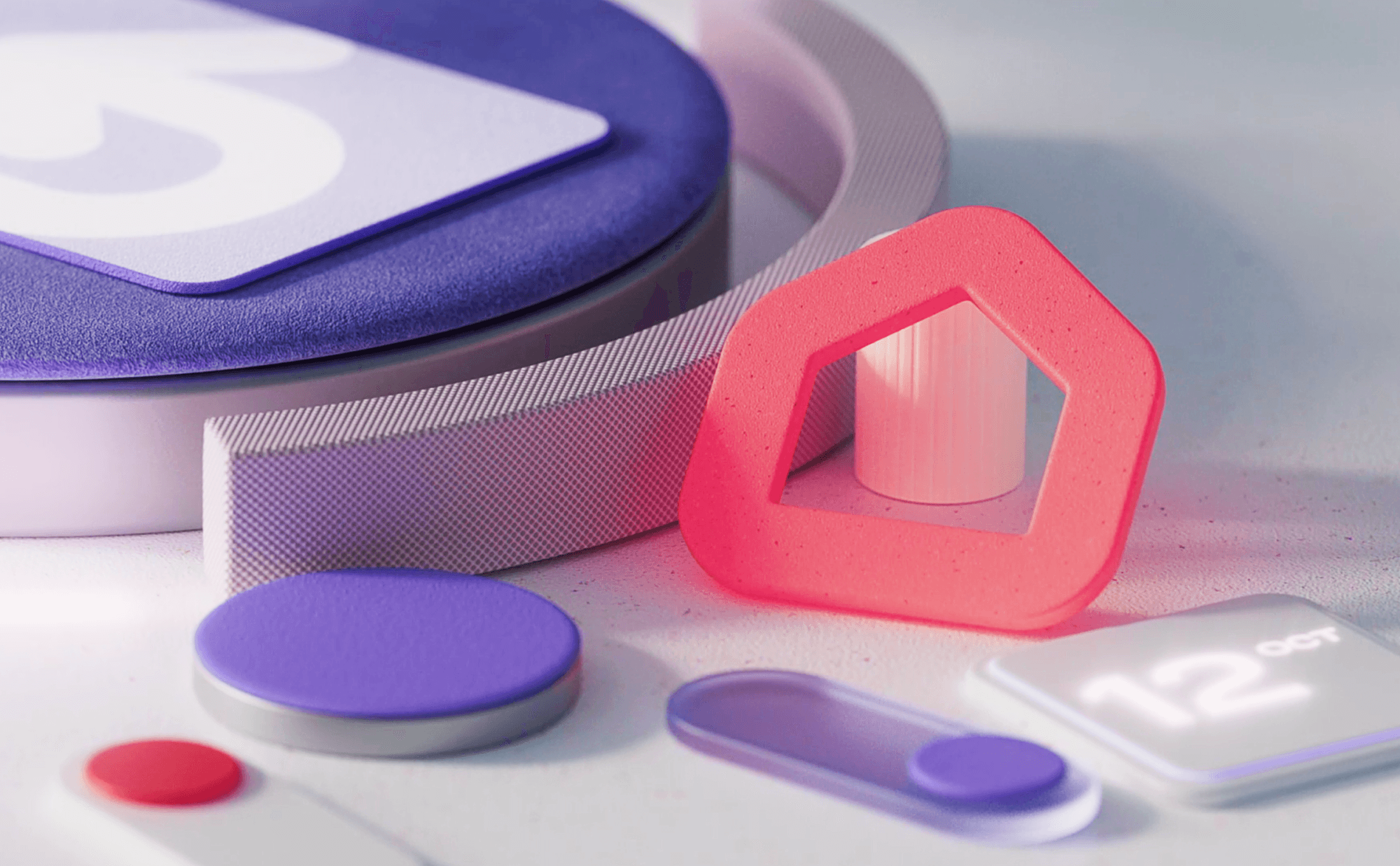
The general concept of 3D graphics — the idea of interaction between objects — reflects the connection between different products and services within MTS, accentuating their ecosystem nature. Plastic forms flow into one another, touch each other, and take recognisable or abstract shapes.
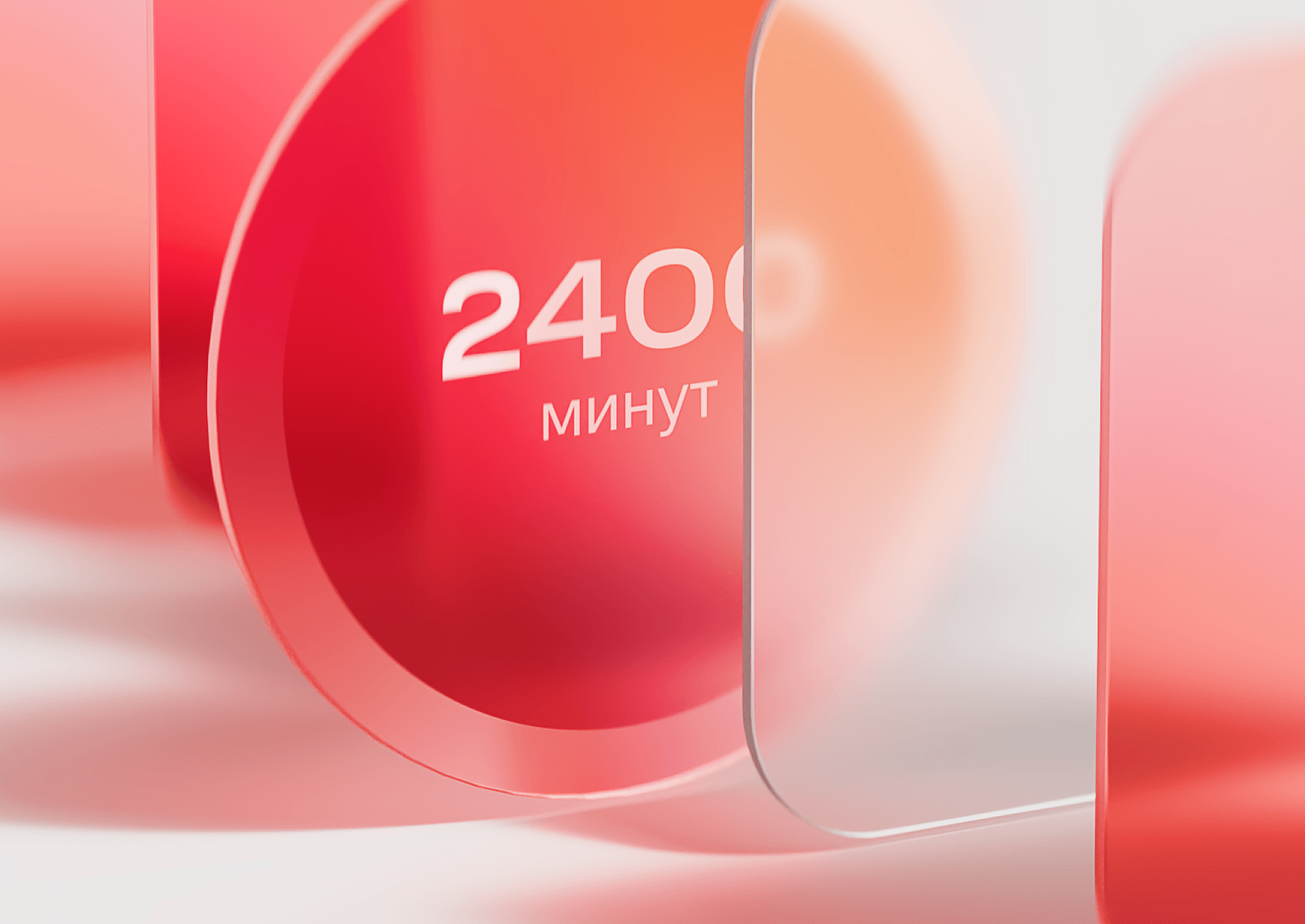
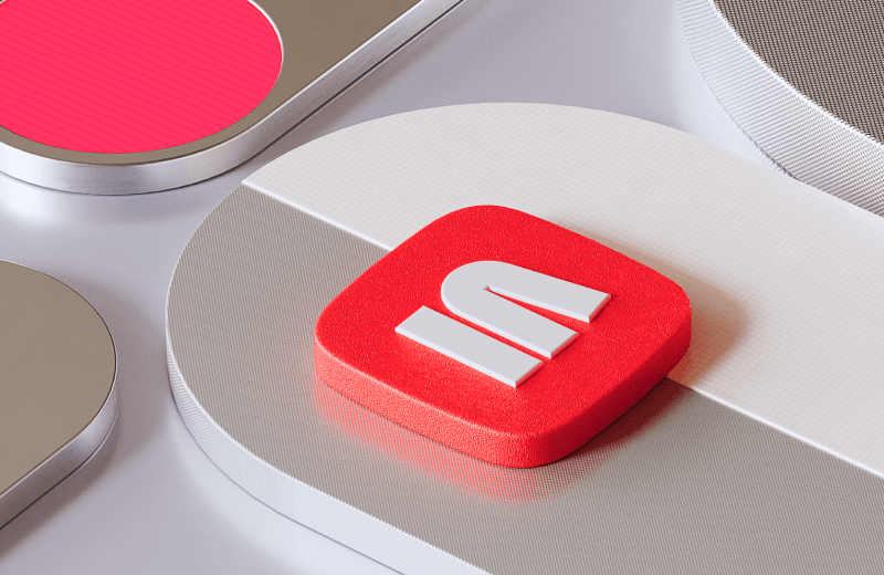
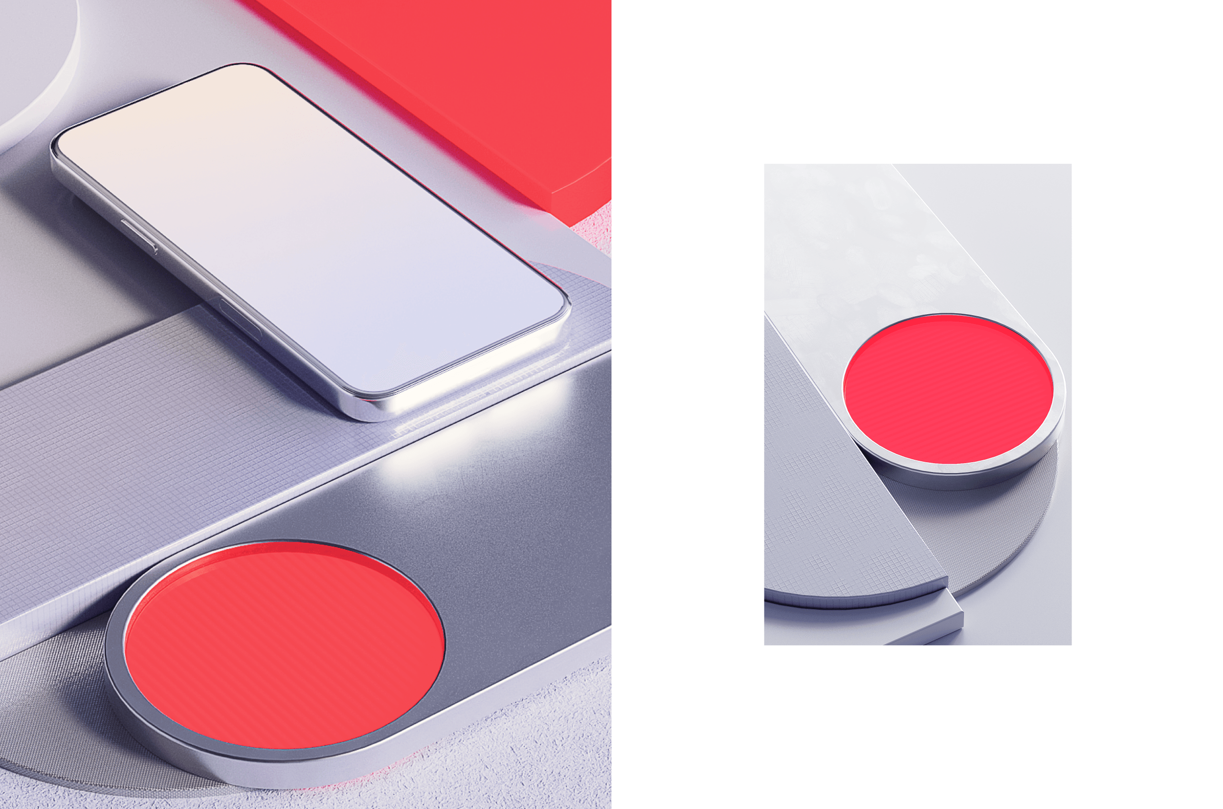
To imitate the digital environment, we worked with the materiality of 3D objects. For this purpose, we used unusual textures — they do not resemble the textures of real-life objects.

To achieve visual diversity in compositions, polar textures with different characteristics are simultaneously used: matte with transparent, and smooth with relief.
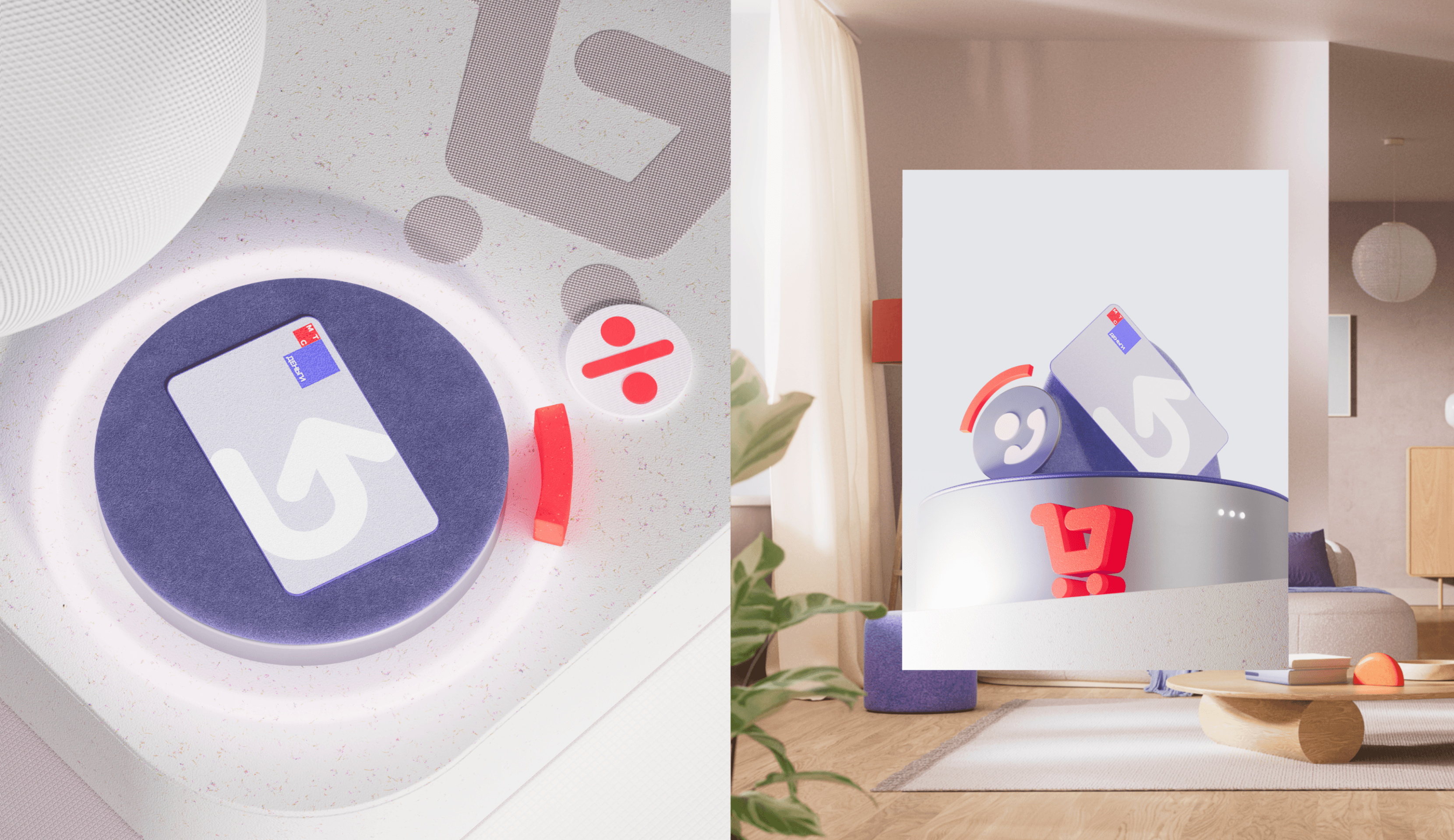
The elements of the style reveal themselves differently in each product. The initial branding constants unify all MTS communications, while additional tools give sub-brands significant freedom.
